Objective
Whilst cruising about on Imgur I found a post about science stuff. Not uncommon, which is nice. These sorts of grab-bag posts about nothing in particular often include some mention of climate science, almost exclusively some sort of clever visualisation of a warming planet. That seems to be what people are most interested in. I’m not complaining though, it keeps me employed. The aforementioned post caught my attention more than usual because it included a GIF, and not just a static picture of some sort of blue thing that is becoming alarmingly red (that was not meant to be a political metaphor). I’m referring to the now famous GIF by climate scientist Ed Hawkins (@ed_hawkins) whose blog may be found here, and the specific post in question here. A quick bit of research on this animation revealed that it has likely been viewed by millions of people, was featured in the opening ceremony of the Rio Olympics, and was created in MATLAB. Those three key points made me decide to do a post on how to re-create this exact figure in R via a bit of reverse engineering. The original GIF in question is below.
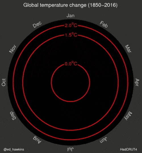
Figure 1: The ever broadening spiral of global temperatures created by Ed Hawkins.
Data
Figure 1 above uses the global mean temperature anomalies taken from HadCRUT4. These data have an impressive range of collection, going back to 1850. Very few datasets match this length of collection, and I’m not going to attempt to do so here. What I am going to do is use the data that I work with on a daily basis. These are the SACTN data that may also be downloaded here via a GUI. As a coastal oceanographer I am mostly interested in changing climates in the near shore. While not publish explicitly, a paper about the appropriate methodology one should use does exist, and this methodology has been applied to all of the time series in the SACTN dataset accordingly. It is therefore known what the rates of decadal change along the coast of South Africa are, and we may rely on this in order to cherry pick the more dramatic time series in order to make prettier visuals.
Code
With our end goal established (Figure 1), and our dataset chosen (SACTN), we may now get busy with the actual code necessary. As one may have inferred from the title of this post, Figure 1 is what we call a “polar plot”. This may appear complex to some, but is actually a very simple visualisation, as we shall see below. But first we need to prep our data. For consistency in the creation of the anomaly values below I will use 1981 – 2010 for the climatology of each time series.
## Libraries
library(tidyverse)
library(viridis)
library(lubridate)
library(zoo)
library(gridExtra)
library(animation)

## Data
# SACTN
load("../../static/data/SACTN_monthly_v4.2.RData")

## Subset
# Subseting function
ts.sub <- function(site){
  ts <- SACTN_monthly_v4.2 %>%
    filter(index == site) %>%
    mutate(year = year(as.yearmon(date)),
           month = month(as.yearmon(date), label = T),
           clim = mean(temp[year %in% seq(1981,2010)], na.rm = T),
           anom = temp-clim,
           index = as.character(index)) %>%
    rename(site = index) %>%
    select(site, year, month, anom)
  return(ts)
}

# Warming site
PN <- ts.sub("Port Nolloth/SAWS")

# Cooling site
SP <- ts.sub("Sea Point/SAWS")

# Neutral site
KB <- ts.sub("Kent Bay/KZNSB")
With our data prepared we may now create the series of functions that will make a spiralling polar plot of temperatures for any time series we feed into it. I prefer to use the animation package to create animations in R. This requires that one also installs image magick beforehand. This is a free software that is available for all major operating systems. There are a few ways to create animations in R, but I won’t go into that now. The method I employ to create the animations below may seem odd at first, but as far as I have seen it is the most efficient way to do so. The philosophy employed here is that we want to have one final function that simply counts forward one step at a time, creating each frame of the GIF. This function calls on other functions that are calculating the necessary stats and creating the visuals from them in the background. By creating animations in this way, our up front prep and calculation time is almost non-existent. It does mean that the animations take longer to compile, but they are also much more dynamic and we may feed any number of different dataframes into them to get different outputs. I have found over the years that the more automated ones code can be the better.
## Function that creates a polar plot
polar.plot <- function(df, i){
  # Add bridges for polar coordinates
  years <- unique(df$year)[1:i]
  df2 <- filter(df, year %in% years)
  bridges <- df2[df2$month == 'Jan',]
  bridges$year <- bridges$year - 1
  if(nrow(bridges) == 0){
    bridges <- data.frame(site = df2$site[1], year = min(df2$year), month = NA, anom = NA)
  } else {
    bridges$month <- NA
  }
  blanks <- data.frame(site = df2$site[1], expand.grid(year = min(df2$year)-1, month = month.abb), anom = NA)
  # Polar plot
  pp <- ggplot(data = rbind(blanks, df2, bridges), aes(x = month, y = anom, group = year)) +
    # Circular black background
    geom_rect(colour = "black", fill = "black", aes(xmin = "Jan", xmax = NA,
                  ymin = min(df$anom, na.rm = T), ymax = max(df$anom, na.rm = T))) +
                  # ymin = min(df$anom, na.rm = T), ymax = 3)) +
    # Anomaly threshold labels
    geom_hline(aes(yintercept = 1.0), colour = "red") +
    geom_label(aes(x = "Jan", y = 1.0, label = "1.0°C"),
               colour = "red", fill = "black", size = 3) +
    geom_hline(aes(yintercept = 2.0), colour = "red") +
    geom_label(aes(x = "Jan", y = 2.0, label = "2.0°C"),
               colour = "red", fill = "black", size = 3) +
    geom_hline(aes(yintercept = 3.0), colour = "red") +
    geom_label(aes(x = "Jan", y = 3.0, label = "3.0°C"),
               colour = "red", fill = "black", size = 3) +
    geom_hline(aes(yintercept = 4.0), colour = "red") +
    geom_label(aes(x = "Jan", y = 4.0, label = "4.0°C"),
               colour = "red", fill = "black", size = 3) +
    # Temperature spiral
    geom_path(aes(colour = anom), show.legend = F) +
    # Scale corrections
    scale_colour_viridis(limits = c(min(df$anom, na.rm = T), max(df$anom, na.rm = T))) +
    scale_x_discrete(expand = c(0,0), breaks = month.abb) +
    scale_y_continuous(expand = c(0,0),
                       limits = c(min(df$anom, na.rm = T), max(df$anom, na.rm = T))) +
    # Year label
    geom_text(aes(x = "Jan", y = min(df$anom, na.rm = T), label = max(df2$year, na.rm = T)),
              colour = "ivory", size = 8) +
    # Additional tweaks
    ggtitle(paste0(df$site[1]," temperature change (",min(df$year),"-",max(df$year),")")) +
    coord_polar() +
    theme(panel.background = element_rect(fill = "grey20"),
          plot.background = element_rect(fill = "grey20"),
          panel.grid.major = element_blank(),
          panel.grid.minor = element_blank(),
          # axis.text.x = element_text(colour = "ivory"),
          axis.text.x = element_text(colour = "ivory", angle =
            (360/(2*pi)*rev(seq(pi/12, 2*pi-pi/12, len = 12)))+15,
            size = 12),
          axis.text.y = element_blank(),
          axis.title = element_blank(),
          axis.ticks = element_blank(),
          axis.ticks.length = unit(0, "cm"),
          plot.title = element_text(hjust = 0.5, colour = "ivory", size = 15))
  print(pp)
}

## Create animation of polar plots
animate.polar.plot <- function(df) {
  lapply(seq(1,length(unique(df$year))), function(i) {
    polar.plot(df = df, i = i)
  })
}
With the above two functions created, we may now call them nested within one another via the saveGIF function below.
# By default 'saveGIF()' outputs to the same folder
# the script where the code is being run from is located.
# For that reason one may want to manually change the
# working directory beforehand.
# setwd("somewhere else")
system.time(saveGIF(animate.polar.plot(df = PN), interval = 0.4, ani.width = 457,
                    movie.name = "polar_plot_PN.gif")) ## 262 seconds
system.time(saveGIF(animate.polar.plot(df = SP), interval = 0.4, ani.width = 457,
                    movie.name = "polar_plot_SP.gif")) ## 221 seconds
system.time(saveGIF(animate.polar.plot(df = KB), interval = 0.4, ani.width = 457,
                    movie.name = "polar_plot_KB.gif")) ## 183 seconds
# setwd("back to where you were")
Summary
As one may see in the following GIFs, local extremes often outpace global averages. This should not be terribly surprising. In order to better illustrate this I have expanded the anomaly labels along the y-axes more so than seen in Figure 1. The increasing patterns are not as clear in these following GIFs as in the original that they are based on. This is because the original is based on a global average, which provides for a much smoother trend. I hope people enjoy these and feel free to plop your own temperature time series into the code to create your own polar plot figures!
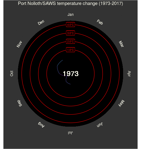
Figure 2: The polar plot for Port Nolloth, where temperatures have been increasing.
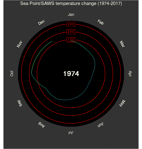
Figure 3: The polar plot for Sea Point, where temperatures have been decreasing.
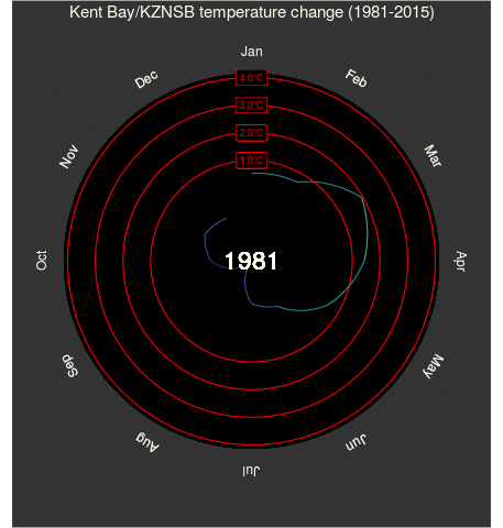
Figure 4: The polar plot for Kent Bay, where temperatures have been holding level.