Objective
With more and more scientists moving to open source software (i.e. R or Python) to perform their numerical analyses the opportunities for collaboration increase and we may all benefit from this enhanced productivity. At the risk of sounding sycophantic, the future of scientific research truly is in multi-disciplinary work. What then could be inhibiting this slow march towards progress? We tend to like to stick to what is comfortable. Oceanographers in South Africa have been using MATLAB and ODV (Ocean Data View) since about the time that Jesus was lacing up his sandals for his first trip to Palestine. There has been much debate on the future of MATLAB in science, so I won’t get into that here, but I will say that the package oce contains much of the code that one would need for oceanographic work in R, and the package angstroms helps one to work with ROMS (Regional Ocean Modeling System) output. The software that has however largely gone under the radar in these software debates has been ODV. Probably because it is free (after registration) it’s fate has not been sealed by university departments looking to cut costs. The issue with ODV however is the same with all Microsoft products; the sin of having a “pointy clicky” user interface. One cannot perform truly reproducible research with a menu driven user interface. The steps must be written out in code. And so here I will lay out those necessary steps to create an interpolated CTD time series of temperature values that looks as close to the default output of ODV as possible.
Colour palette
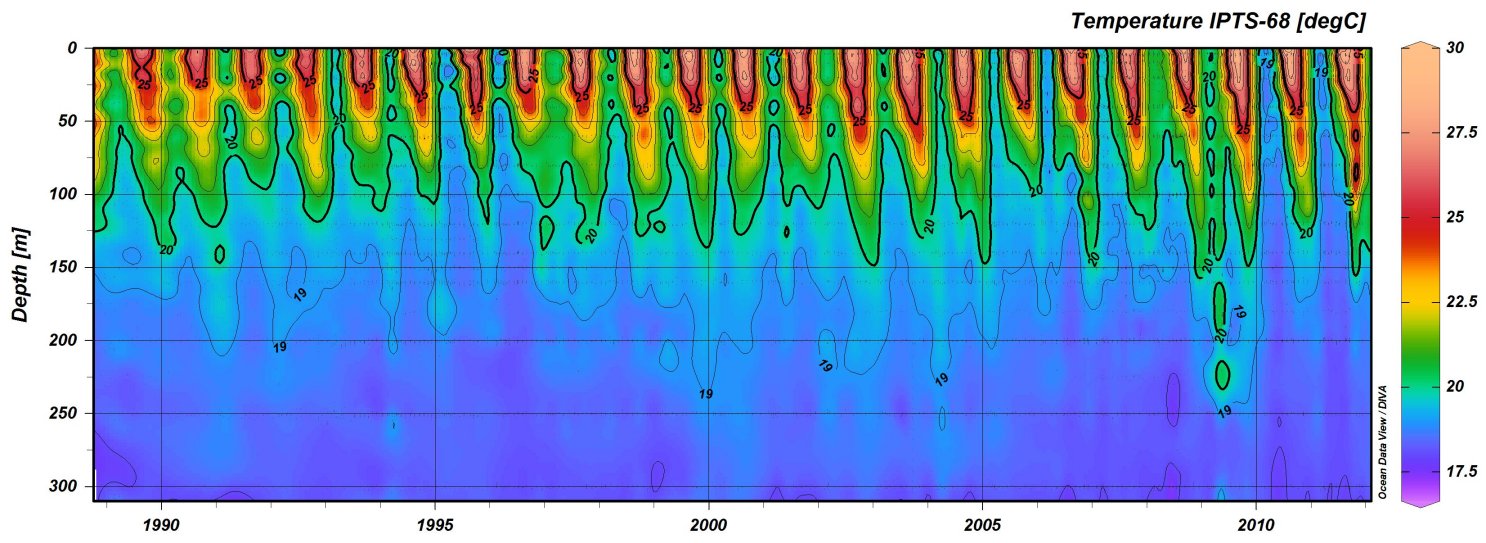
Perhaps the most striking thing about the figures that ODV creates is it’s colour palette. A large criticism of this colour palette is that the range of colours used are not equally weighted visually, with the bright reds drawing ones eye more than the muted blues. This issue can be made up for using the viridis package, but for now we will stick to a ODV-like colour palette as that is part of our current objective. To create a colour palette that appears close to the ODV standard I used GIMP to extract the hexadecimal colour values from the colour bar in Figure 1.
# Load libraries
library(tidyverse)
library(lubridate)
library(reshape2)
library(MBA)
library(mgcv)

# Load and screen data
  # For ease I am only using monthly means
  # and depth values rounded to 0.1 metres
ctd <- read_csv("../../static/data/ctd.csv") %>%
  mutate(depth  = -depth) %>%  # Correct for plotting
  filter(site == 1) %>%
  select(date, depth, temperature) %>%
  rename(temp = temperature) #%>%
### Uncomment out the following lines to reduce the data resolution
  # mutate(date = round_date(date, unit = "month")) %>%
  # mutate(depth = round(depth, 1)) %>%
  # group_by(date, depth) %>%
  # summarise(temp = round(mean(temp, na.rm = TRUE),1))
###

# Manually extracted hexidecimal ODV colour palette
ODV_colours <- c("#feb483", "#d31f2a", "#ffc000", "#27ab19", "#0db5e6", "#7139fe", "#d16cfa")

# Create quick scatterplot
ggplot(data = ctd, aes(x = date, y = depth)) +
  geom_point(aes(colour = temp)) +
  scale_colour_gradientn(colours = rev(ODV_colours)) +
  labs(y = "depth (m)", x = NULL, colour = "temp. (°C)")
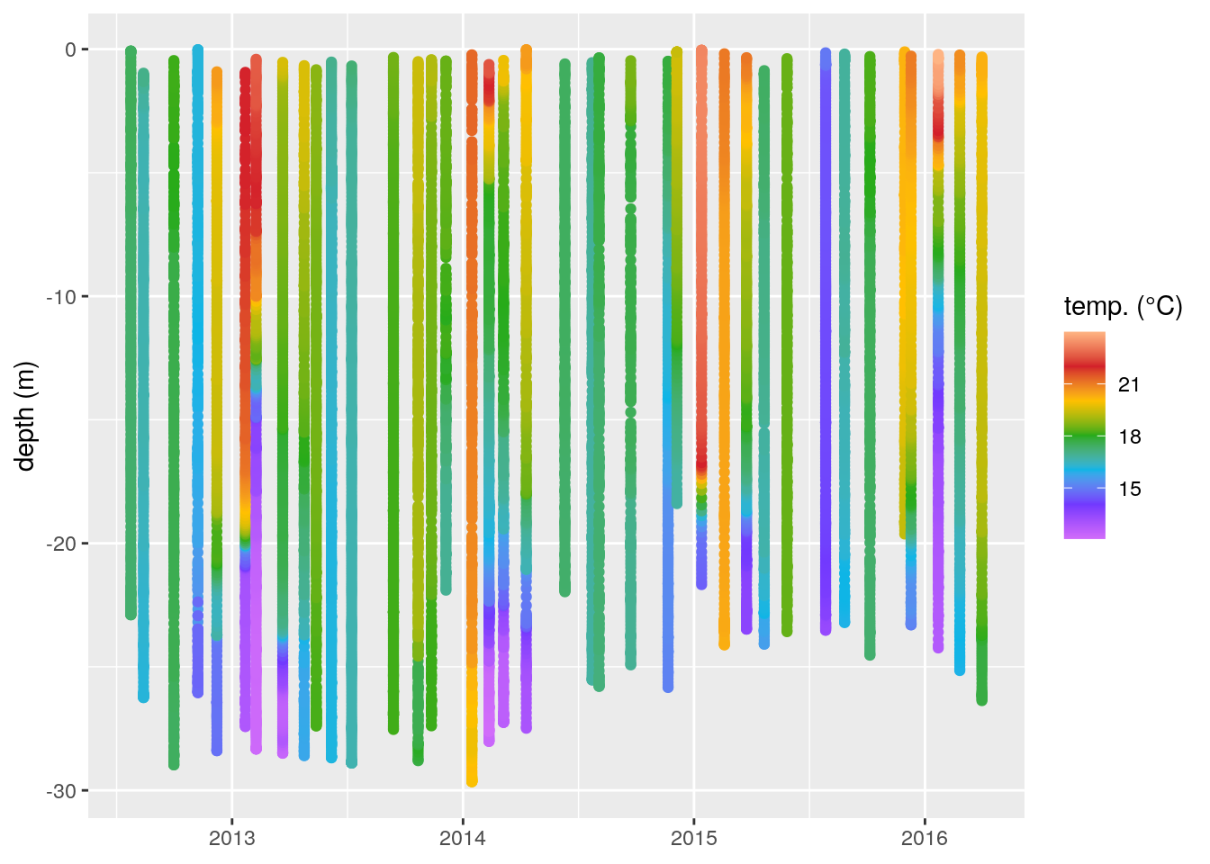
Figure 2: A non-interpolated scatterplot of our temperature (°C) data shown as a function of depth (m) over time.
Interpolating
Figure 2 is a far cry from the final product we want, but it is a step in the right direction. One of the things that sets ODV apart from other visualisation software is that it very nicely interpolates the data you give it. While this looks nice, there is some criticism that may be leveled against doing so. That being said, what we want is a pretty visualisation of our data. We are not going to be using these data for any numerical analyses so the main priority is that the output allows us to better visually interpret the data. The package MBA already has the necessary functionality to do this, and it works with ggplot2, so we will be using this to get our figure. The interpolation method used by mba.surf() is multilevel B-splines.
In order to do so we will need to dcast() our data into a wide format so that it simulates a surface layer. spread() from the tidyr package doesn’t quite do what we need as we want a proper surface map, which is outside of the current ideas on the structuring of tidy data. Therefore, after casting our data wide we will use melt(), rather than gather(), to get the data back into long format so that it works with ggplot2.
It is important to note with the use of mba.surf() that it transposes the values while it is creating the calculations and so creating an uneven grid does not work well. Using the code written below one will always need to give the same specifications for pixel count on the x and y axes.
# The date column must then be converted to numeric values
ctd$date <- decimal_date(ctd$date)

# Now we may interpolate the data
ctd_mba <- mba.surf(ctd, no.X = 300, no.Y = 300, extend = T)
dimnames(ctd_mba$xyz.est$z) <- list(ctd_mba$xyz.est$x, ctd_mba$xyz.est$y)
ctd_mba <- melt(ctd_mba$xyz.est$z, varnames = c('date', 'depth'), value.name = 'temp') %>%
  filter(depth < 0) %>%
  mutate(temp = round(temp, 1))

# Finally we create our gridded result
ggplot(data = ctd_mba, aes(x = date, y = depth)) +
  geom_raster(aes(fill = temp)) +
  scale_fill_gradientn(colours = rev(ODV_colours)) +
  geom_contour(aes(z = temp), binwidth = 2, colour = "black", alpha = 0.2) +
  geom_contour(aes(z = temp), breaks = 20, colour = "black") +
### Activate to see which pixels are real and not interpolated
  # geom_point(data = ctd, aes(x = date, y = depth),
  #            colour = 'black', size = 0.2, alpha = 0.4, shape = 8) +
###
  labs(y = "depth (m)", x = NULL, fill = "temp. (°C)") +
  coord_cartesian(expand = 0)
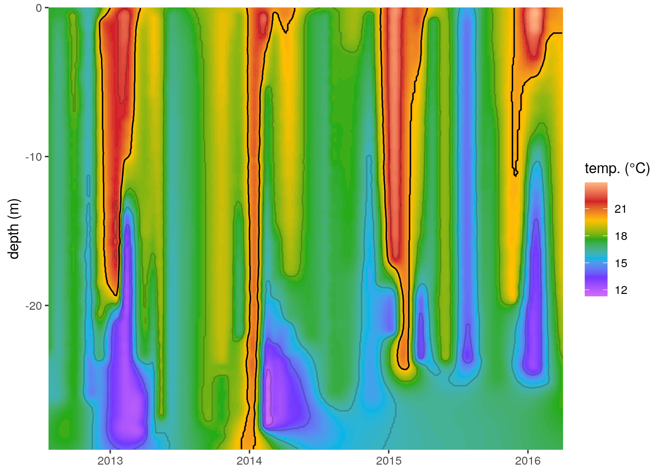
Figure 3: The same temperature (°C) profiles seen in Figure 2 with the missing values filled in with multilevel B-splines. Note the artefact created in the bottom right corner. The 20°C contour line is highlighted in black.
At first glance this now appears to be a very good approximation of the output from ODV. An astute eye will have noticed that the temperatures along the bottom right corner of this figure are not interpolating in a way that appears possible. It is very unlikely that there would be a deep mixed layer underneath the thermoclines detected during 2015. The reason the splines create this artefact is that they are based on a convex hull around the real data points and so the interpolating algorithm wants to perform a regression towards a mean value away from the central point of where the spline is being calculated from. Because the thermoclines detected are interspersed between times where the entire water column consists of a mixed layer mba.surf() is filling in the areas without data as though they are a fully mixed surface layer.
Bounding boxes
There are many ways to deal with this problem with four possible fixes coming to mind quickly. The first is to set extend = F within mba.surf(). This tells the algorithm not to fill up every part of the plotting area and will alleviate some of the inaccurate interpolation that occurs but will not eliminate it. The second fix, which would prevent all inaccurate interpolation would be to limit the depth of all of the temperature profiles to be the same as the shallowest sampled profile. This is not an ideal fix because we would then lose quite a bit of information from the deeper sampling that occurred from 2013 to 2014. The third fix is to create a bounding box and screen out all of the interpolated data outside of it. A fourth option is to use soap-film smoothing over some other interpolation method, such as a normal GAM, concurrently with a bounding box. This is normally a good choice but does not work well with these data so I have gone with option three.
# Create a bounding box
  # We want to slightly extend the edges so as to use all of our data
left <- ctd[ctd$date == min(ctd$date),] %>%
  select(-temp) %>%
  ungroup() %>%
  mutate(date = date-0.01)
bottom <- ctd %>%
  group_by(date) %>%
  summarise(depth = min(depth)) %>%
  mutate(depth = depth-0.01)
right <- ctd[ctd$date == max(ctd$date),] %>%
  select(-temp) %>%
  ungroup() %>%
  mutate(date = date+0.01)
top <- ctd %>%
  group_by(date) %>%
  summarise(depth = max(depth)) %>%
  mutate(depth = depth+0.01)
bounding_box <- rbind(data.frame(left[order(nrow(left):1),]), data.frame(bottom),
                      data.frame(right), data.frame(top[order(nrow(top):1),]))

# Now that we have a bounding box we need to
# screen out the pixels created outside of it
bounding_box_list <- list(bounding_box)
names(bounding_box_list[[1]]) <- c("v","w")
v <- ctd_mba$date
w <- ctd_mba$depth
ctd_mba_bound <- ctd_mba[inSide(bounding_box_list, v, w),]

# Correct date values back to date format
  # Not used as it introduces blank space into the figure
# ctd_mba_bound$date <- as.Date(format(date_decimal(ctd_mba_bound$date), "%Y-%m-%d"))


# The screened data
ggplot(data = ctd_mba_bound, aes(x = date, y = depth)) +
  geom_raster(aes(fill = temp)) +
  scale_fill_gradientn(colours = rev(ODV_colours)) +
  geom_contour(aes(z = temp), binwidth = 2, colour = "black", alpha = 0.2) +
  geom_contour(aes(z = temp), breaks = 20, colour = "black") +
  labs(y = "depth (m)", x = NULL, fill = "temp. (°C)") +
  coord_cartesian(expand = 0)
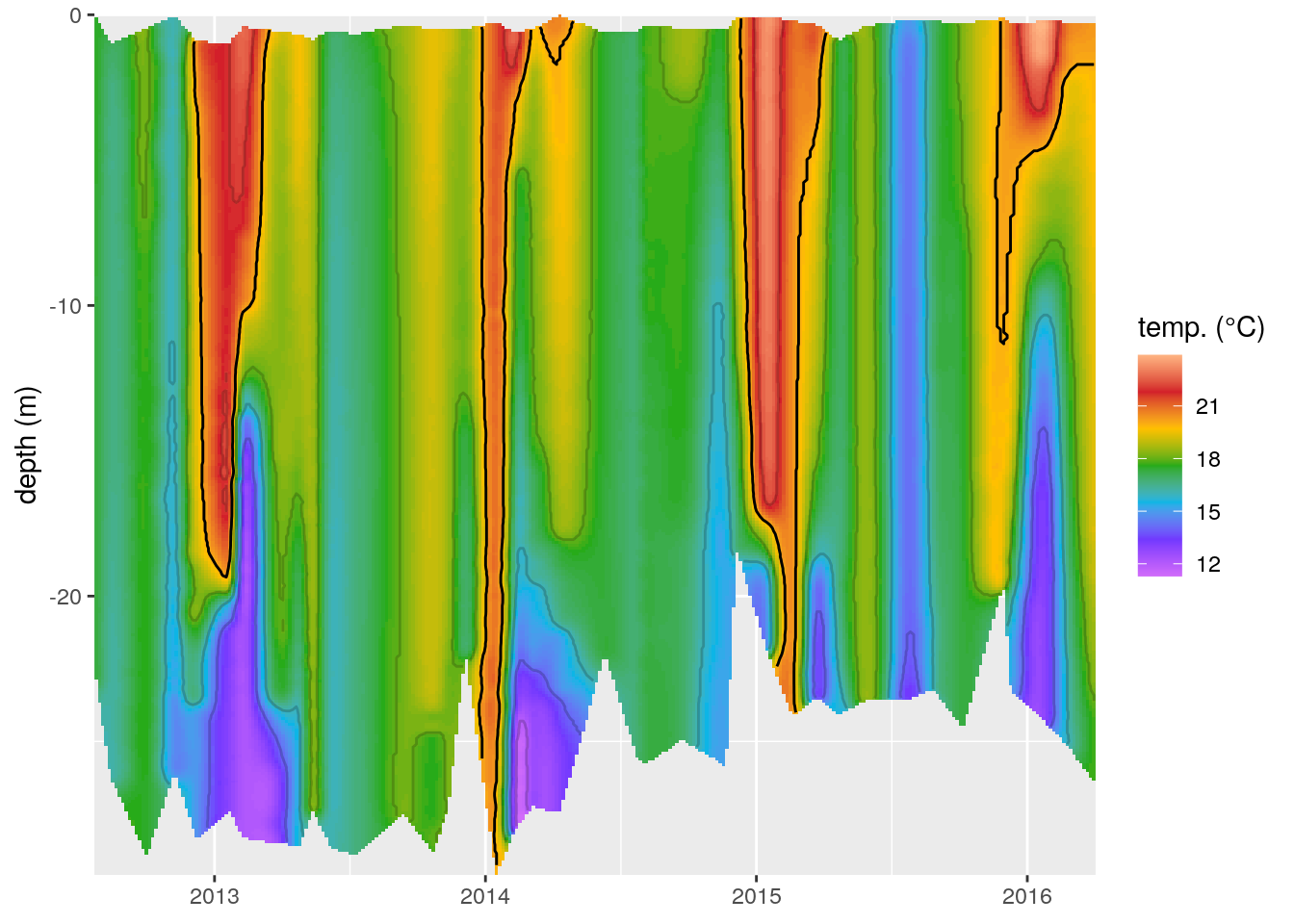
Figure 4: The same temperature (°C) profiles seen in Figure 3 with a bounding box used to screen out data interpolated outside of the range of the recordings.
Summary
In this short tutorial we have seen how to create an interpolated temperature depth profile over time after a fashion very similar to the default output from ODV. We have also seen how to either fill the entire plotting area with interpolated data (Figure 3), or quickly generate a bounding box in order to remove any potential interpolation artefacts (Figure 4). I think this is a relatively straight forward work flow and would work with any tidy dataset. It is worth noting that this is not constrained to depth profiles, but would work just as well with map data. One would only need to change the date and depth variables to lon and lat.
R is an amazingly flexible language with an incredible amount of support and I’ve yet to see it not be able to emulate, or improve upon, an analysis or graphical output from any other software.