Objective
As more and more physical scientists (e.g. oceanographers) move to R from other object oriented command line programming languages, such as Matlab, there will be more and more demand for the code that is needed to do some basic things that they may already know how to do in their previous languages that they don’t yet know how to do in R. Surprisingly, there are many things that should be very easy to find how to do in R that are not. Or are at least not widely publicized. One such example is how to plot wind vectors as a time series. This is a very necessary part of any analysis of the wind or currents in a particular area. Making it useful broadly to most climate scientists. Try as I might, I’ve only been able to find one source that gives an example of how to plot wind (or current) vectors as a time series with ggplot2 in R. Having now been asked how to do this by several people I thought it would be useful to write up my workflow and put it on the internet so that there is one more source that people searching for answers may find.
Data
The data used in this example come from the ERA-Interim reanalysis product. This is an amazing product with dozens of data layers stretched over an even global grid at a native resolution of 0.75°. Here we use the one pixel from this product closest to Cape Town in order to illustrate how to use these data as a time series for a single point in space at a daily resolution for one month (December, 2016). For the purposes of this example we will only be using the following three layers: ‘2 metre temperature’, ‘10 metre U wind component’ and ‘10 metre V wind component’. The data used in this post may be downloaded here.
# First load libraries
library(tidyverse)
library(scales)

# Then data
load('../../static/data/ERA_pixel.Rdata')
Wind Vectors
The data as they exist within ERA-Interim are already in the format that we need. U and V vectors. Had they not been then we would have needed to convert them. The other common format for wind data are bearing (degrees) and speed (m/s). With this information it is possible to use trigonometry to create the necessary U and V vectors. One may do so with the following chunk of code:
## Assuming your data frame is called 'my_df'
# First it is necessary to correct any bearings of '0' to '360'
my_df$bearing[my_df$bearing == 0] <- 360
my_df$u <- (1 * my_df$speed) * sin((my_df$bearing * pi / 180.0))
my_df$v <- (1 * my_df$speed) * cos((my_df$bearing * pi / 180.0))
Assuming that we now have a u and v column in our wind vector data frame, and that the speed of these vectors are in metres per second, we may now use the functionality within ggplot2 to create our wind vector time series. It’s almost anti-climactic how straight forward it all is.
Plotting
As we will be using geom_segment() within ggplot2 to create our wind vectors we will want to maintain some control over the output by introducing a scaling object and a default range for the y axis. For now we will just set the wind scalar to 1. We’ll change it later to see what benefit this extra step adds. I have chosen the range of values for the y_axis below based on what I knew would illustrate my point, not through any a priori statistical analysis.
wind_scale <- 1
y_axis <- seq(-5, 5, 5)
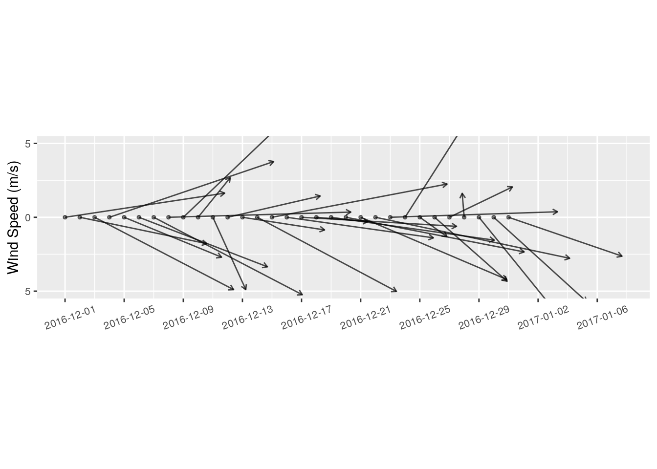
To create a wind vector time series we use the following few lines of code:
ggplot(data = ERA_pixel, aes(x = date, y = y_axis)) +
  # Here we create the wind vectors as a series of segments with arrow tips
    geom_segment(aes(x = date, xend = date + u*wind_scale, y = 0, yend = v*wind_scale),
                 arrow = arrow(length = unit(0.15, 'cm')), size = 0.5, alpha = 0.7) +
  # I think adding points at the base of the vectors makes the figure easier to read
    geom_point(aes(x = date, y = 0), alpha = 0.5, size = 1) +
  # Changing the dates to better match the range shown on the x axis
    scale_x_date(labels = date_format('%Y-%m-%d'), breaks = date_breaks('4 days')) +
  # Change the y axis labels to make sense
    scale_y_continuous(breaks = y_axis, labels = as.character(abs(y_axis)/wind_scale)) +
  # Change the x and y axis labels
    labs(x = NULL, y = 'Wind Speed (m/s)') +
    coord_equal(ylim = c(min(y_axis/wind_scale), max(y_axis/wind_scale))) +
    theme(axis.text.x = element_text(angle = 20, hjust = 0.4, vjust = 0.5, size = 8),
          axis.text.y = element_text(size = 8))

Visualizing wind data in this way introduces a problem into our figure that we do not normally need to contend with when we create time series figures. That problem is that wind speed/ bearing is a two dimensional value, not one dimensional. Therefore the y axis as well as the x axis must be utilized in order to show the wind speed/ bearing accurately. We find a compromise by using coord_equal() to ensure that every step on the x axis is the same size as the y axis. Thus preventing any distortion of vectors that are showing mostly an East/ West heading.
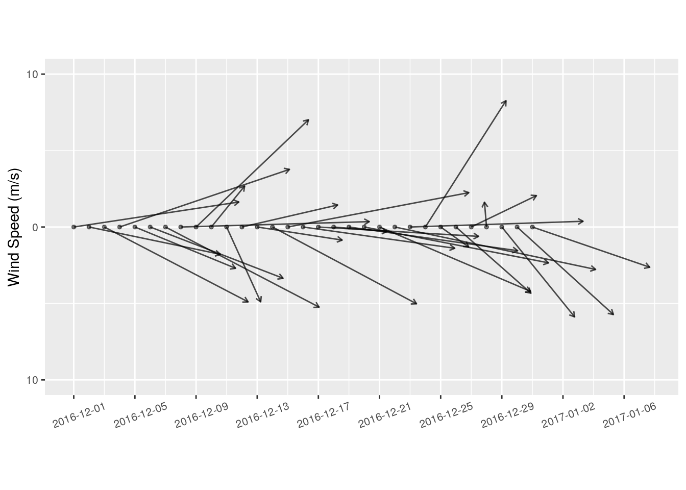
For particularly windy parts of the world (such as Cape Town) it may be better to scale the wind vectors so as to help them to look a bit more tidy. But if we do this, our x and y axis relationship will no longer be 1 for 1, as with the figure above. That is where our decision to set a static wind scalar and y axis come into play.
# Reset the wind scalar to be half the size
wind_scale <- 0.5

# The exact same code as above
ggplot(data = ERA_pixel, aes(x = date, y = y_axis)) +
    geom_segment(aes(x = date, xend = date + u, y = 0, yend = v),
                 arrow = arrow(length = unit(0.15, 'cm')), size = 0.5, alpha = 0.7) +
    geom_point(aes(x = date, y = 0), alpha = 0.5, size = 1) +
    scale_x_date(labels = date_format('%Y-%m-%d'), breaks = date_breaks('4 days')) +
    scale_y_continuous(breaks = y_axis/wind_scale, labels = as.character(abs(y_axis)/wind_scale)) +
    labs(x = NULL, y = 'Wind Speed (m/s)') +
    coord_equal(ylim = c(min(y_axis/wind_scale), max(y_axis/wind_scale))) +
    theme(axis.text.x = element_text(angle = 20, hjust = 0.4, vjust = 0.5, size = 8),
          axis.text.y = element_text(size = 8))

By assigning our scaling variable to an object and using it to control the y axis of our ggplot code we may be sure that no matter how we choose to scale our wind variables they will be correctly represented. This does however limit how large our y axis may be as it must be kept to the same ratio as the x axis. Any larger than the figure shown above and we would start to have unappealingly square figures.
Multiple Y Axes
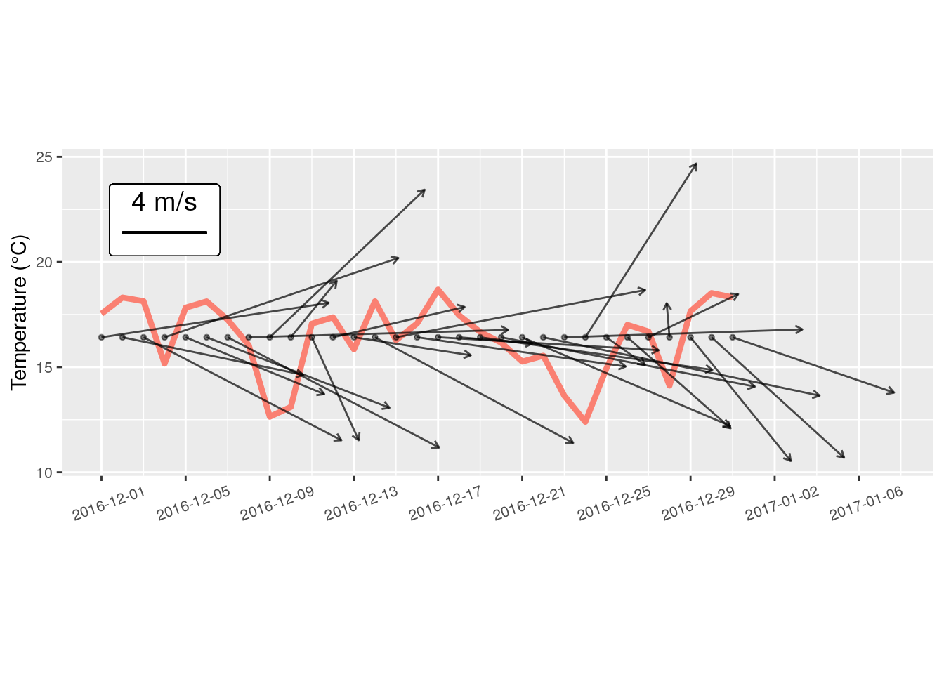
While it may be frowned upon in the tidyverse, there are still many people that like to use multiple y axes within one figure. I’m not going to get into the pro’s and con’s here, but I will say that of all the possible reasons for using multiple y axes, comparing wind vectors against some other variable is more reasonable than most. This is because the wind vectors themselves do not really have a y axis per se. As we’ve seen above, the actual values on the y axis don’t matter as long as they are shown 1 for 1 against whatever is on the x axis. Therefore we may very easily show temperature on the y axis and still overplot wind vectors without needing a proper second y axis. We will however insert a label onto the figure so as to make it clear how the wind vectors are to be estimated.
# Reset the wind scale to 1
wind_scale <- 1

# Now we use temperature for the y axis, so some things must change
ggplot(data = ERA_pixel, aes(x = date, y = temp)) +
    geom_line(colour = 'salmon', show.legend = F, size = 1.5) +
    geom_segment(aes(x = date, xend = date + u,
                     y = mean(temp, na.rm = T), yend = mean(temp, na.rm = T) +v),
                 arrow = arrow(length = unit(0.15, 'cm')), size = 0.5, alpha = 0.7) +
    geom_point(aes(x = date, y = mean(temp, na.rm = T)), alpha = 0.5, size = 1) +
  # Create the label box for our wind vector length legend
    geom_label(aes(x = as.Date('2016-12-04'), y = 22, label = '  4 m/s  \n'), size = 5) +
  # Create the segment for the wind vector legend
    geom_segment(aes(x = as.Date('2016-12-02'), xend = as.Date('2016-12-06'),
                     y = 21.4, yend = 21.4), size = 0.5, alpha = 0.7) +
    scale_x_date(labels = date_format('%Y-%m-%d'), breaks = date_breaks('4 days')) +
    labs(x = NULL, y = 'Temperature (°C)') +
  # Here we choose to allow ggplot to determine the best range for y axis values
    coord_equal() +
    theme(axis.text.x = element_text(angle = 20, hjust = 0.4, vjust = 0.5, size = 8),
          axis.text.y = element_text(size = 8))

I’ll leave it to the reader to decide if this is a reasonable way to visualise these data. But I do know that there is some use for displaying the information in this way. For example, one can clearly see that on days were the temperature decreases rapidly there is a south westerly wind moving over the city. Of course this could still be elucidated were these two figures plotted next to each other via facets, but it should be noted that it isn’t necessary.