Objective
Most people living in the Western World are very quick to extol the virtues of gender equality. There are however many places where this is not so. This then inevitably leads to conflict as cultures and nations are drawn closer together on our ever shrinking earth. Perhaps not the sort of conflict that leads to sabre rattling, but certainly ideological disagreements that affect policy and have real impacts on large swathes of humanity. So what is to be done? How can say how anyone else should be. There are of course all sorts of moral back and forth’s that could be pursued cyclically ad nauseum, but what if we could show quantitatively what the benefit of gender equality was to a nation and the lives of it’s people? That is the exact sort of question I like to answer here at this blog and it is a question that came up in my daily life a couple of weeks ago. Because most metrics for most countries are recorded, this is the sort of thing that can be answered. Indeed, it has been before, so here I add another take on an argument that really shouldn’t still be happening…
Data
In order to quantify the benefit of gender equality we are going to need global census data, as this is a conversation that needs to be had at a global level. Happily for us these data may be found at Clio Infra. This is an amazing web hosted database that contains an unexpected range of information as it aggregates data from many other sources. I’ll likely be going back to this data repository on multiple occasions in the future. But for now we’ll stick to gender equality. For this post we will be looking at a number of variables as this allows us to develop a more nuanced view of the relationships that exist between the wealth of nations and the egalitarianism their cultures engender. It is unfortunately not possible to show causality in the relationships we will model below but I think that educated readers will likely arrive at the same inferences as myself. Of course, if anyone has any objections, faults or errors to point out in the analysis that follows I would be very happy to hear them.
The data used in this blog were downloaded in “Compact” form, which comes in .xlsx format. These files were then opened and only the tab containing the data in long format were saved as a .csv file. As an aside, these data are visualised on the Clio Infra website as boxplots using what is clearly ggplot2 code. Also note that unless specified all values are taken as either women/ men or women-men. Meaning that proportions below 1, or negative values signify greater abundance for men than women in those populations.
I’ve chosen o use the metrics seen below as I think they represent inequality between genders as well as throughout populations as a whole.
## Load libraries
library(tidyverse)
library(broom)
# library(RColorBrewer)

## Load data
# Educational Inequality Gini Coefficient (after age 15)
education_inequality <- read_csv("../../static/data/EducationalInequalityGiniCoefficient.csv") %>%
  mutate(variable = "education_inequality")
# GDP per Capita
gdp_per_capita <- read_csv("../../static/data/GDPperCapita.csv") %>%
  mutate(variable = "gdp_per_capita")
# Gender Equality Years of Education (after age 15)
gender_equality_education <- read_csv("../../static/data/GenderEqualityYearsofEducation.csv") %>%
  mutate(variable = "gender_equality_education")
# Historical Gender Equality Index
gender_equality_index <- read_csv("../../static/data/HistoricalGenderEqualityIndex_Compact.csv") %>%
  mutate(variable = "gender_equality_index")
# Gender Equality of Numeracy
gender_equality_numeracy <- read_csv("../../static/data/GenderEqualityofNumeracy_Compact.csv") %>%
  mutate(variable = "gender_equality_numeracy")
# Income Inequality
income_inequality <- read_csv("../../static/data/IncomeInequality.csv") %>%
  mutate(variable = "income_inequality")
# Sex Ratio (ages 0 - 5)
sex_ratio <- read_csv("../../static/data/SexRatio_Compact.csv") %>%
  mutate(variable = "sex_ratio")
# Total Population
total_population <- read_csv("../../static/data/TotalPopulation_Compact.csv") %>%
  mutate(variable = "total_population",
         value = scale(value)) # Scale the large range
# Average Years of Education (after age 15)
years_of_education <- read_csv("../../static/data/AverageYearsofEducation.csv") %>%
  mutate(variable = "education_years")

## Create different dataframe
data_long <- rbind(gdp_per_capita, education_inequality, gender_equality_education,
                   gender_equality_index, gender_equality_numeracy, income_inequality,
                   sex_ratio, total_population, years_of_education)
Analysis
I recently learned how to use the dplyr pipe (%>%) to perform nested models and so am excited to put that to use here. Our first step is to run simple linear models for each metrics we have loaded against GDP per capita without controlling for time (year of sampling) or space (country). The GDP per capita will be correctly compared against it’s corresponding metric at that year and in that country, but we are then allowing mean values effectively to be made of these results. These models will provide us with a range of R^2 values (coefficients of determination), which is the statistic showing how much of the variance in a dependent variable is explained by the independent variable. This allows us to see which of our metrics have the strongest relationship with GDP per capita. Which we may infer as being related to the prosperity of a nation and it’s people.
# Here we run linear models on all available data against GDP per capita
  # We are not controlling for country or year
lm_data_all <- data_long %>%
  left_join(., gdp_per_capita[,-5], by = c("ccode", "country.name", "year")) %>%
  rename(., value = value.x, gdp = value.y) %>%
  group_by(variable) %>%
  mutate(n = sum(!is.na(gdp))) %>%
  ungroup() %>%
  nest(-n, -variable) %>%
  mutate(fit = map(data, ~ lm(value ~ gdp, data = .)),
    results = map(fit, glance)) %>%
  unnest(results) %>%
  select(n, variable, adj.r.squared, p.value) %>%
  arrange(-adj.r.squared) %>%
  filter(variable != "gdp_per_capita")

# These data are best represented with a table
knitr::kable(lm_data_all, digits = 3, caption = "R^2 and p-values for the relationship between several metrics and GDP per capita. Years and country of sampling were not controlled for.")
Table: Table 1: R^2 and p-values for the relationship between several metrics and GDP per capita. Years and country of sampling were not controlled for.
| n | variable | adj.r.squared | p.value |
|---|---|---|---|
| 1162 | education_years | 0.623 | 0.000 |
| 215 | gender_equality_index | 0.523 | 0.000 |
| 134 | gender_equality_education | 0.321 | 0.000 |
| 9779 | education_inequality | 0.318 | 0.000 |
| 656 | income_inequality | 0.106 | 0.000 |
| 348 | gender_equality_numeracy | 0.075 | 0.000 |
| 205 | sex_ratio | 0.053 | 0.001 |
| 1371 | total_population | -0.001 | 0.760 |
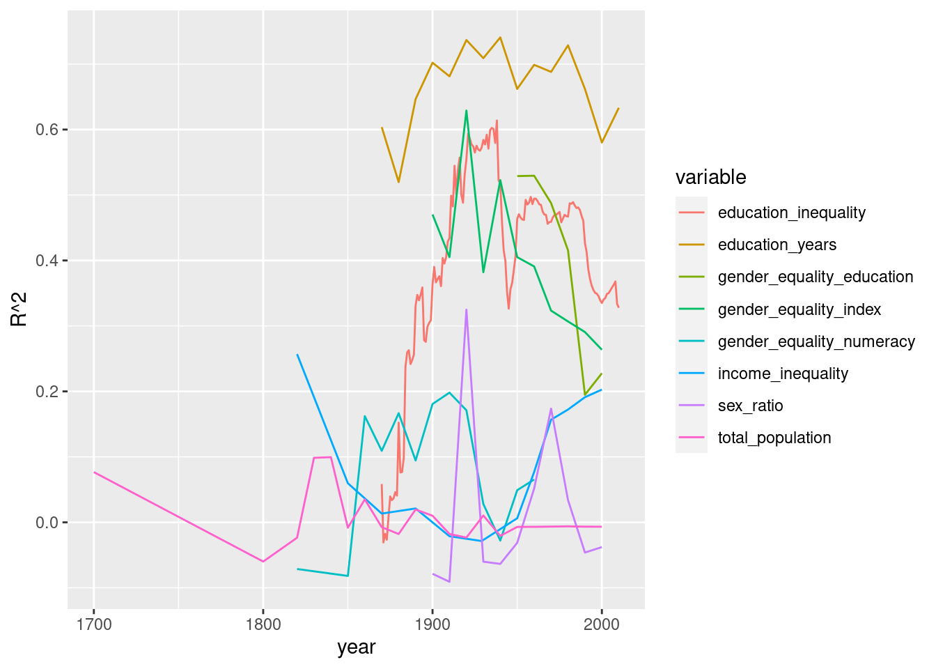
It is possible however that these relationships have not been static over time. We will also want to display the changes in the R^2 values as time series.
# Or we may control for years of sampling
  # This allows us to see if the relationship changes much over time
lm_data_year <- data_long %>%
  left_join(., gdp_per_capita[,-5], by = c("ccode", "country.name", "year")) %>%
  rename(., value = value.x, gdp = value.y) %>%
  group_by(year, variable) %>%
  mutate(n = sum(!is.na(gdp))) %>%
  ungroup() %>%
  filter(n > 10) %>% # Require at least 10 data points
  nest(-n, -year, -variable) %>%
  mutate(fit = map(data, ~ lm(value ~ gdp, data = .)),
    results = map(fit, glance)) %>%
  unnest(results) %>%
  select(n, variable, year,  adj.r.squared, p.value) %>%
  arrange(-adj.r.squared) %>%
  filter(variable != "gdp_per_capita")

# And now for a time series
ggplot(data = lm_data_year, aes(x = year, y = adj.r.squared)) +
  geom_line(aes(colour = variable)) +
  labs(y = "R^2")

# Or we may control for the country of sampling
  # This allows us to see if these relationships
  # differ in certain parts of the world
lm_data_country <- data_long %>%
  left_join(., gdp_per_capita[,-5], by = c("ccode", "country.name", "year")) %>%
  rename(., value = value.x, gdp = value.y) %>%
  group_by(country.name, variable) %>%
  mutate(n = sum(!is.na(gdp))) %>%
  ungroup() %>%
  filter(n > 10) %>% # Require at least 10 data points
  nest(-n, -country.name, -variable) %>%
  mutate(fit = map(data, ~ lm(value ~ gdp, data = .)),
    results = map(fit, glance)) %>%
  unnest(results) %>%
  select(n, variable, country.name,  adj.r.squared, p.value) %>%
  arrange(-adj.r.squared) %>%
  filter(variable != "gdp_per_capita")

# Create labels for figure
lm_label <- lm_data_country %>%
  select(n, variable) %>%
  group_by(variable) %>%
  summarise(n = sum(n))

# These data allow us to display the range of R^2 values
# for each country with boxplots
  # Just to be cheeky let's use the same themeas Clio Infra
ggplot(data = lm_data_country, aes(x = variable, y = adj.r.squared)) +
  geom_boxplot(outlier.colour = NA) +
  geom_point(colour = "steelblue", alpha = 0.6, position = "jitter") +
  geom_text(data = lm_label, aes(y = -0.1, label = n),
            colour = "royalblue3") +
  labs(y = "R^2") +
  theme(axis.text.x = element_text(angle = 15))

Years of education of the populace is constantly coming out on top, with gender equality in education in third. These two metrics must be related in some way though so let’s look specifically at that relationship.
data_gender <- years_of_education[,-5] %>%
  left_join(., gender_equality_education[,-5], by = c("ccode", "country.name", "year")) %>%
  rename(., education_years = value.x, gender_equality_education = value.y)
data_gender <- data_gender[complete.cases(data_gender$gender_equality_education),]

lm_data_gender1 <- glance(lm(gender_equality_education ~ education_years, data = data_gender))
lm_data_gender2 <- glance(lm(gender_equality_education ~ education_years,
                             data = filter(data_gender, education_years >= 5)))

# And now for a scatterplot
ggplot(data = data_gender, aes(x = education_years,
                                  y = gender_equality_education)) +
  geom_point() +
  geom_smooth(colour = "blue", method = "lm") +
  geom_smooth(data = filter(data_gender, education_years >= 5), colour = "red", method = "lm") +
  geom_label(aes(x = 8.5, y = 0.5, label = paste0("blue line\nR^2 = ",
                                                  round(lm_data_gender1$adj.r.squared,3),
                                                  "\nred line\nR^2 = ",
                                                  round(lm_data_gender2$adj.r.squared,3))))

Results
From Table 1 we may see that the three metrics in descending order that best explain the variance occurring in GDP per capita over time and space are: education of the population as a whole, equality between the genders and the equality in education between the genders. Equality in education for the populace as a whole came in at a close fourth and is perhaps a better predictor than equality between genders due to the much higher sample size that the result is based on (this is an oddly well reported metric). The metrics of income inequality for the populace as a whole, equality in numeracy between genders, and the ratio of sex near birth showed significant relationships with GDP per capita but explained little of the variance. The total population of a country has absolutely nothing to do with the GDP per capita when time and space are not controlled for.
We see in Figure 1 that for our top four metrics (education_years, gender_equality_index, gender_equality_education and education_inequality), only education_years shows any consistency over time. We also see that education_inequality has become a much better test of the GDP per capita of a country since the mid 19th century.
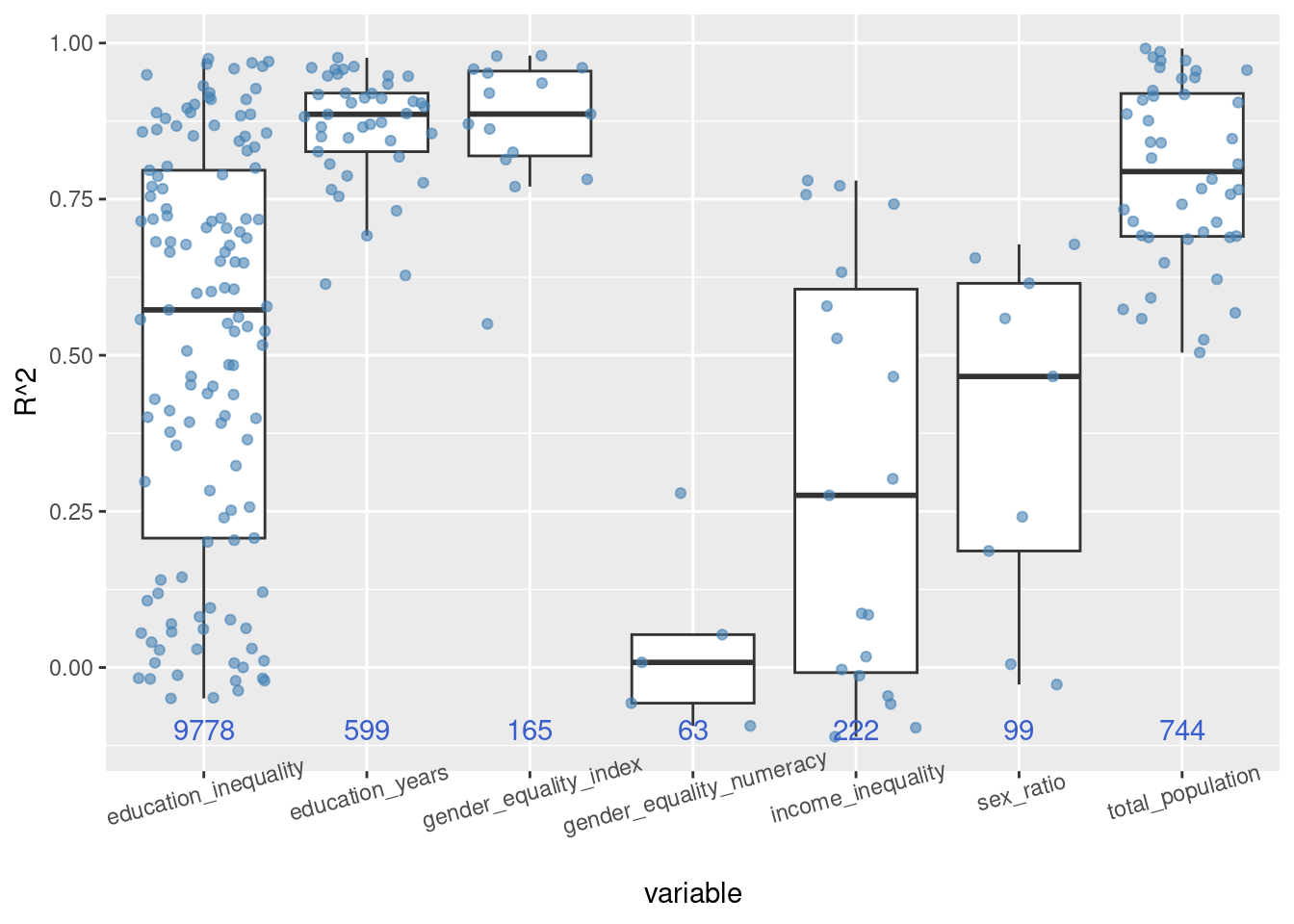
Figure 2 shows that there is a very large range in the relationship between many of these metrics and GDP per capita when we control for country of measurement. Interestingly, the total_population of the country is relevant to the GDP per capita when this information is analysed independently by each country. More important than total_population we see are the metrics education_years and gender_equality_index.
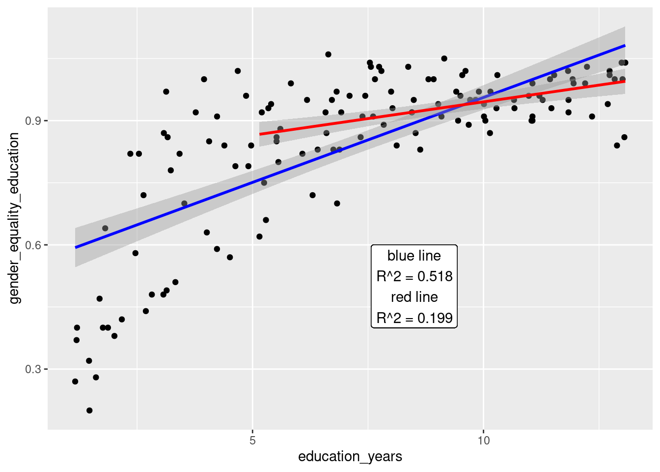
When we look at the specific relationship between education_years and gender_equality_education it would at first appear that at an R^2 value of 0.518 this was a strong relationship. Looking more closely at Figure 3 one will notice that this relationship is not linear and that the fit of the linear model is being affected by several scores at very low education levels and equality scores. If one were to only account for scores where the education_years metric is at least 5 years the strength of the relationship falls dramatically to R^2 = 0.199.
Discussion
If one was satisfied to take all of the GDP data and the several metrics of equality used in this analysis and clump them together one would be led to believe that the most important thing for a prosperous society is the overall years of education for that countries citizens. This metric is clearly the most important in Table 1, Figure 1 and Figure 2. Equality in education between the genders is also of great importance, though perhaps half as much so as the overall education of the populace. It leads that a society with more equitable education levels between genders would have a greater proportion of educated people and this is generally so however, Figure 3 shows that if one removes scores from nations with particularly low levels of overall education this relationship falls apart. This is because most countries in the world have relatively even levels of education between genders. There is little pattern here because there is little variance in gender_equality_education once the less educated nations have been removed from the calculation.
More important to GDP than equal education for genders appears to be the overall equality between genders. This value accounts for much more than education alone and appears to better capture how an egalitarian society benefits from the equal treatment of it’s citizens. Clio Infra states that this metric represents:
The composite index aims to evaluate countries’ performances regarding the progress they made in closing the gender gap in the fields of health, socio-economic resources, politics and household since 1950
When I started this research I had assumed that equal education between genders would clearly be a very important metric in regards to a prosperous society. Surprisingly this appears to not be as concrete as expected. It certainly is important, more so than income inequality, for example, but is not as important as the overall equality between the genders. This finding is deceiving though because the equality in education for most countries (not just rich ones) is high. It is the difference in equality between genders generally that shows a broader range, and the difference relates strongly to GDP per capita. So a potential recipe for success seems to be to first ensure that as much of a populace as possible (of all genders) receives as much education as possible. It seems likely that this would then fuel gender equality, but the data don’t show this unilaterally. So to really move a nation to the top of the GDP per capita list would also require an active effort in ensuring well rounded rights to all genders.